Officeology Case Study
For this class project my client, Jessica, contacted me to re-design her logo and create a branding guide for her office supply store, Officeology. We started this project towards the end of October and finished in late November.
The Discovery Process
To start this process we set up a meeting where I asked her questions to get to know her and her brand better. She mentioned she wished she had a different color scheme that was brighter, the logo to have a modern feel, and she wanted the colors as well as the logo itself to pop more. The core values she wanted me to represent in her brand included the following:
- Brand Loyalty
- Fun
- Cheerful
- Honest
- Great friendly atmosphere
- Personable with customers

Her target audience included individuals who own local businesses and need office supplies. Her mission statement was very thorough, looking through it I was able to pull more attributes that represented her brand:
- Solution driven
- Positivity
- Commitment to brilliance
- Empathy
- Creativity
Design Process
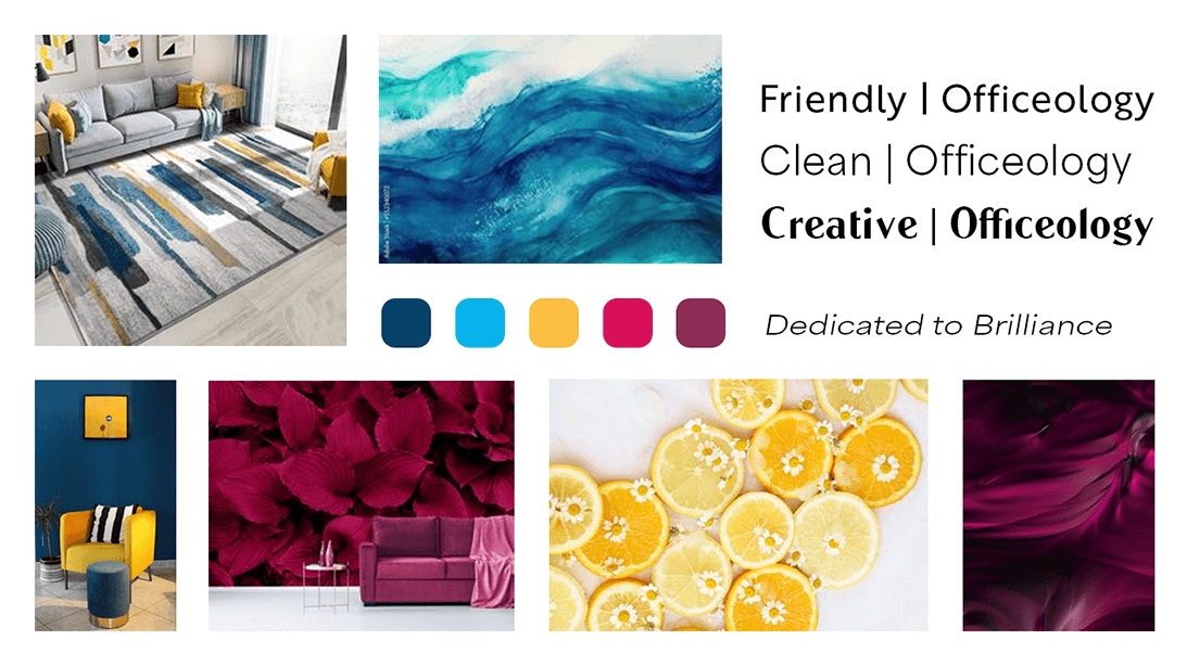
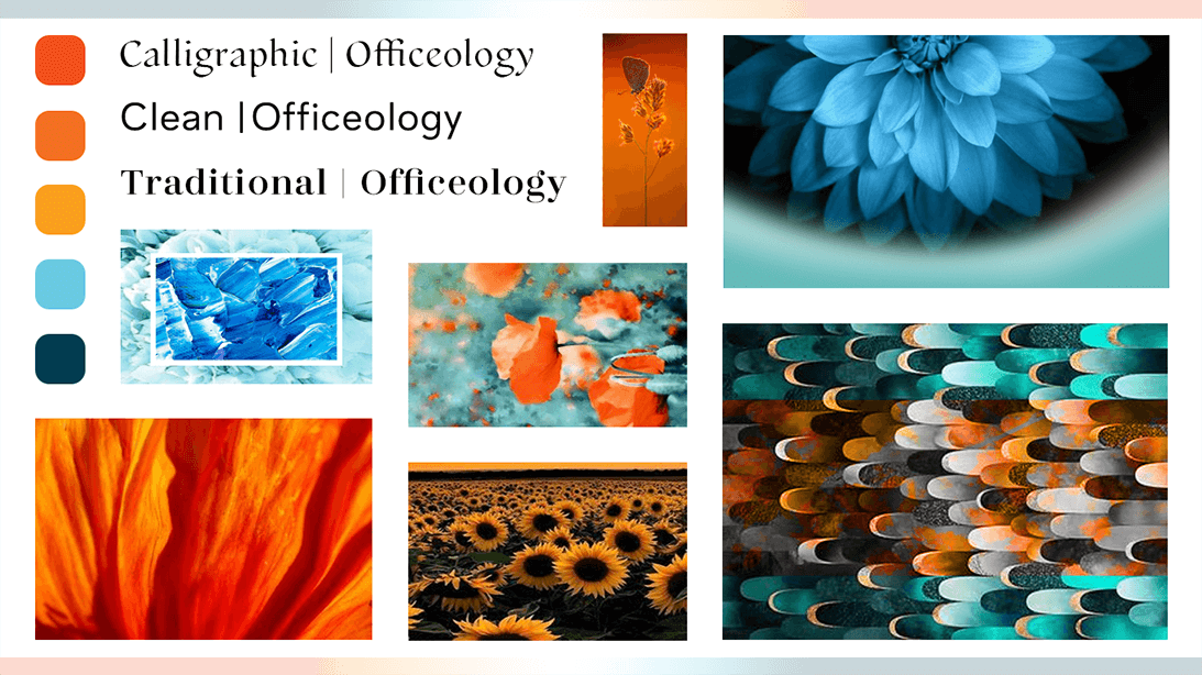
The first step in my design process is to create various mood boards that give the client a feel for what the logo could end up looking like. I gave her two options for the color scheme, one based on the original logo colors, just brighter, and another that I felt represented her core values best. The color scheme we ended up choosing was a combination of blue hues, yellow, purple, and pink. Blue is synonymous with honesty and is a trustworthy color. Yellow is positive, fun, cheerful, and linked to creativity. Purple is linked to empathy, and I chose a bright pink to offset the purple. The psychology behind the colors all accurately represents her core values, and to make sure the logo visually represents these values further, I wanted to do the same for the fonts.
To have a modern look and feel all the fonts we agreed on were san-serif fonts. And because creativity is one of her core values, the name of her business is creative, along with a creative tagline: “The Science of Productivity”, it was only fitting to greet her customers with a creative font. We ended up choosing LTC Globe Gothic for the primary font. With honesty being a core value, I wanted to have a trustworthy font as a secondary option for her tagline, for this we went with Zahrah Tamil Medium. And finally, to tie everything together we needed a friendly font that’s easy to ready for anything written in body copy, for this we agreed on Brother 1816 regular.
Logo Drafts
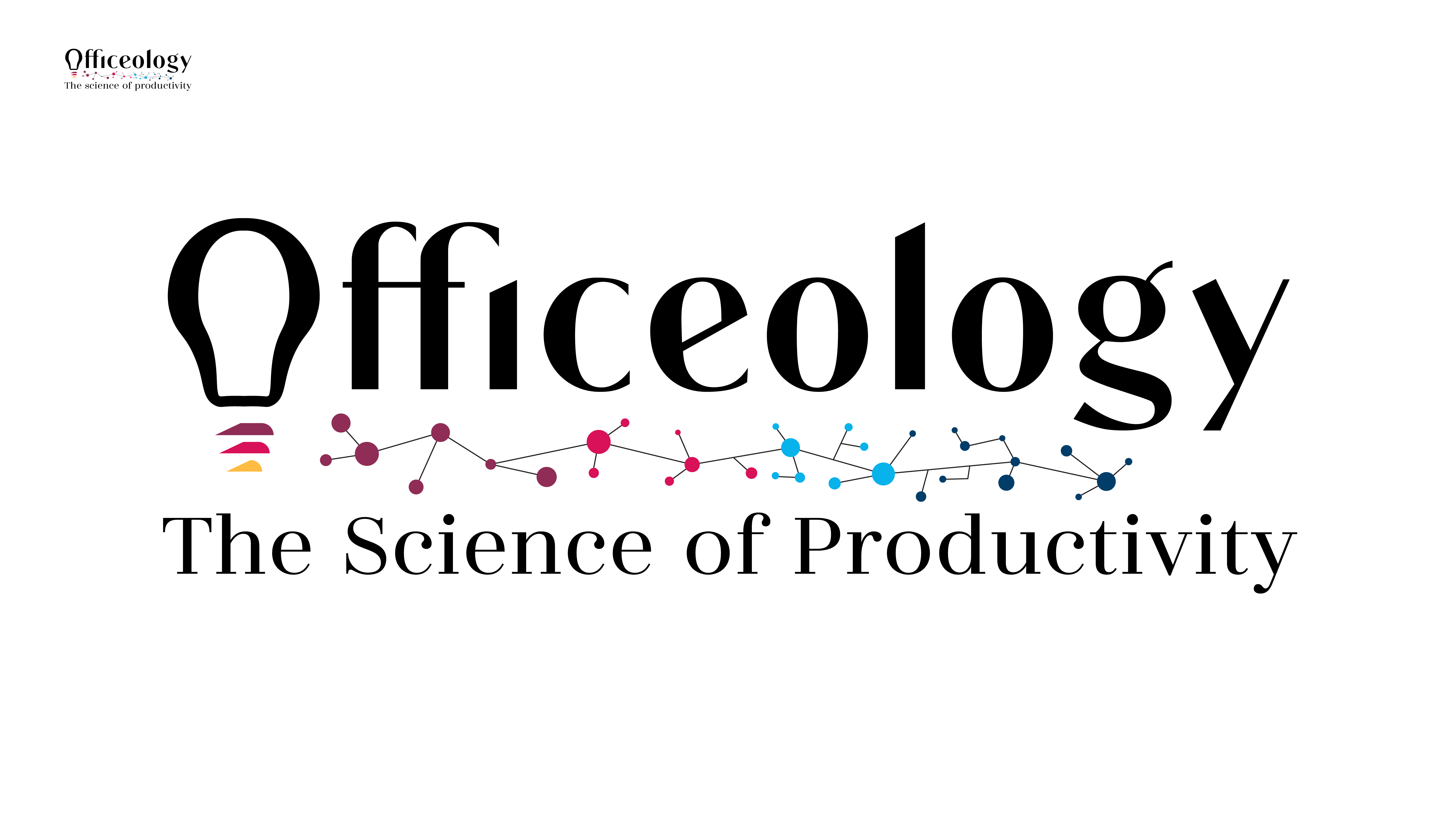
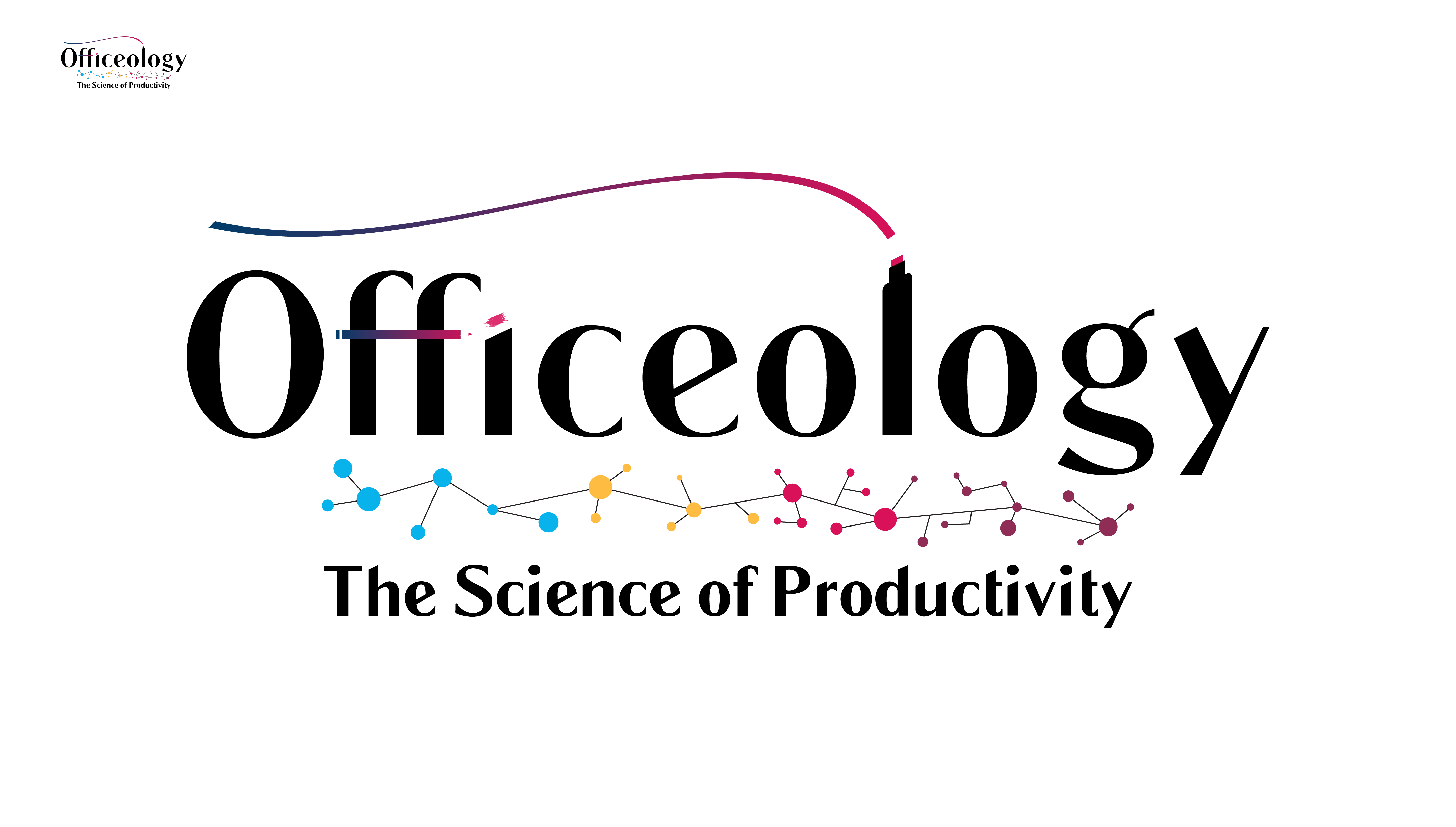
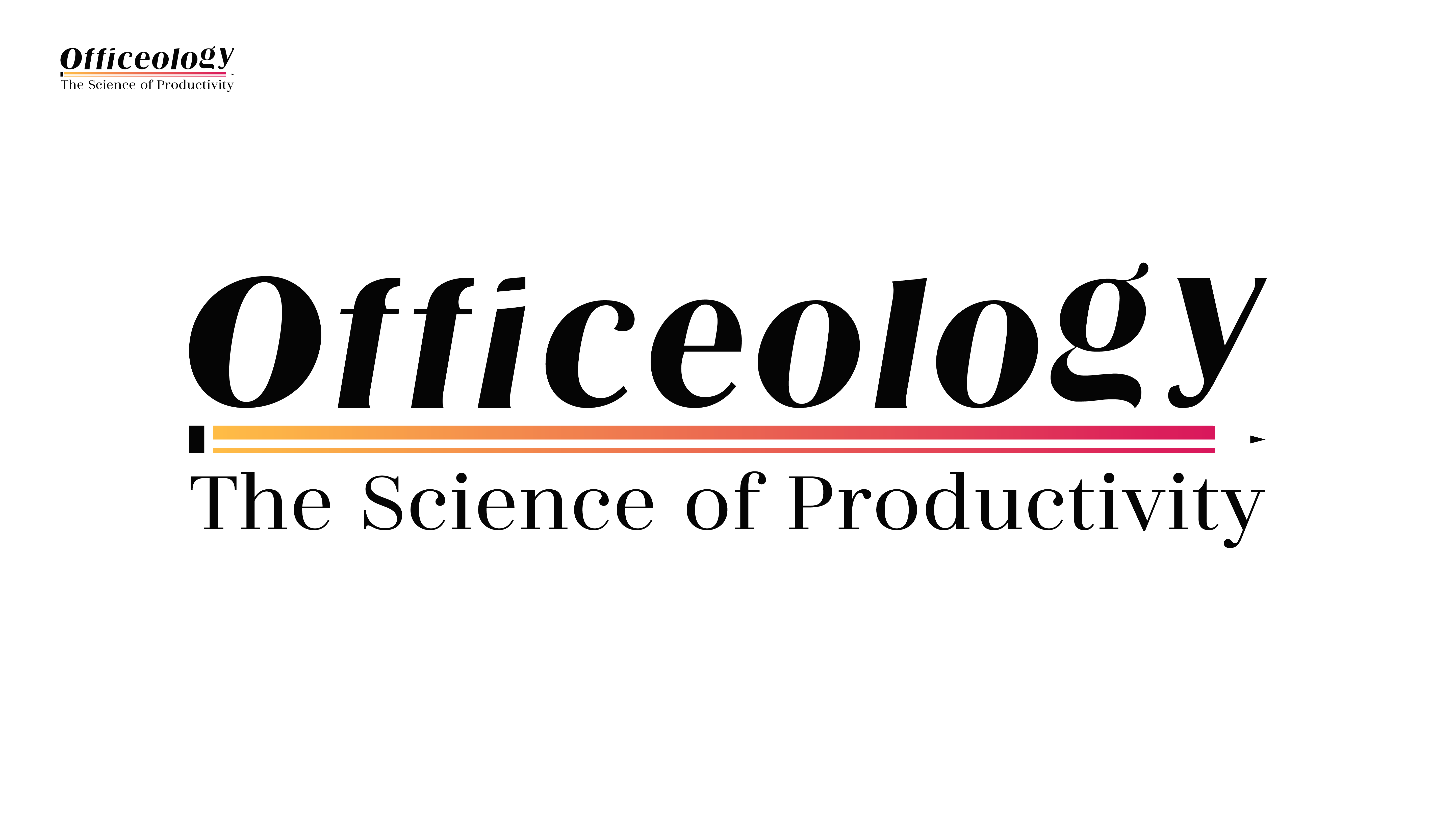
The next step is taking everything I’ve learned from our meetings and start drafting logo options. For these options I presented, I wanted to have a play on words with her tagline, “The Science of Productivity” I desired something in the logo to represent a combination of science and productivity. This is represented throughout the variations I showed Jessica.
After we narrowed down what logo we liked I made a few revisions and finalized her logo.
The Final Result
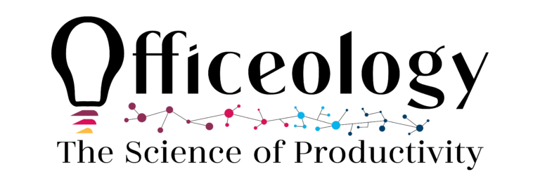
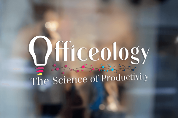
Right away I was excited when Jessica mentioned her, “commitment to brilliance” in her mission statement. That phrase made me think of a lightbulb going off when someone has an idea or is being productive, so I knew I wanted to use a lightbulb somewhere in the logo. I also wanted to have a science aspect in the logo and ended up with molecules as a divider to separate the logo from the tagline. Combining all these created a modern logo that was unique to my client and her brand.
The Takeaway
I learned so much going through this process with Jessica that I’m thankful for. From communicating with a client to researching and finding elements and from there, creating estimates and contracts, to learning more about my own design process. This was an experience I won’t soon forget.