ImBliss Case Study
For this class: Integrated Web Concepts or IWC, I worked with a group. With three developers and one marketer, we were tasked with creating an e-commerce website that matched a target audience we were assigned at random.
The Beginning
My team was assigned the target audience: Trendsetters, which is a fancy term for individuals who live by the phrase “You only live once.” They always have the newest or hottest item on the market whether that be a phone, car, or stylish outfit. The product category we were assigned was healthy food/snacks.
To kick off this process we began researching our target audience, and studying how other e-commerce websites appeal to trendsetters. We looked into a plethora of sites. A site I found that matched our category and target audience was Sakara Life. This website has a clean, classy, and luxurious look, I took note of this to study further and review when designing the look of our website.
The Design Process
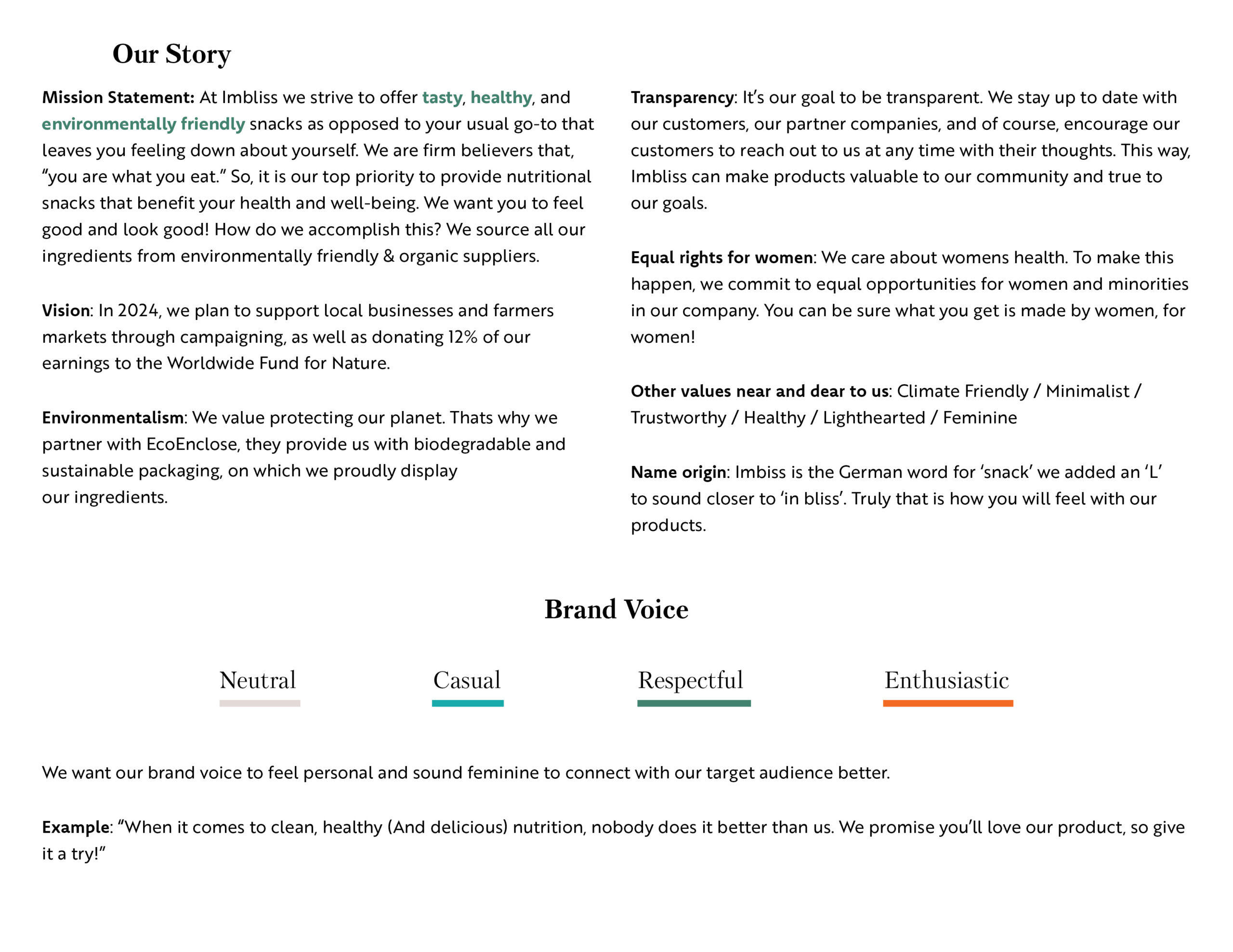
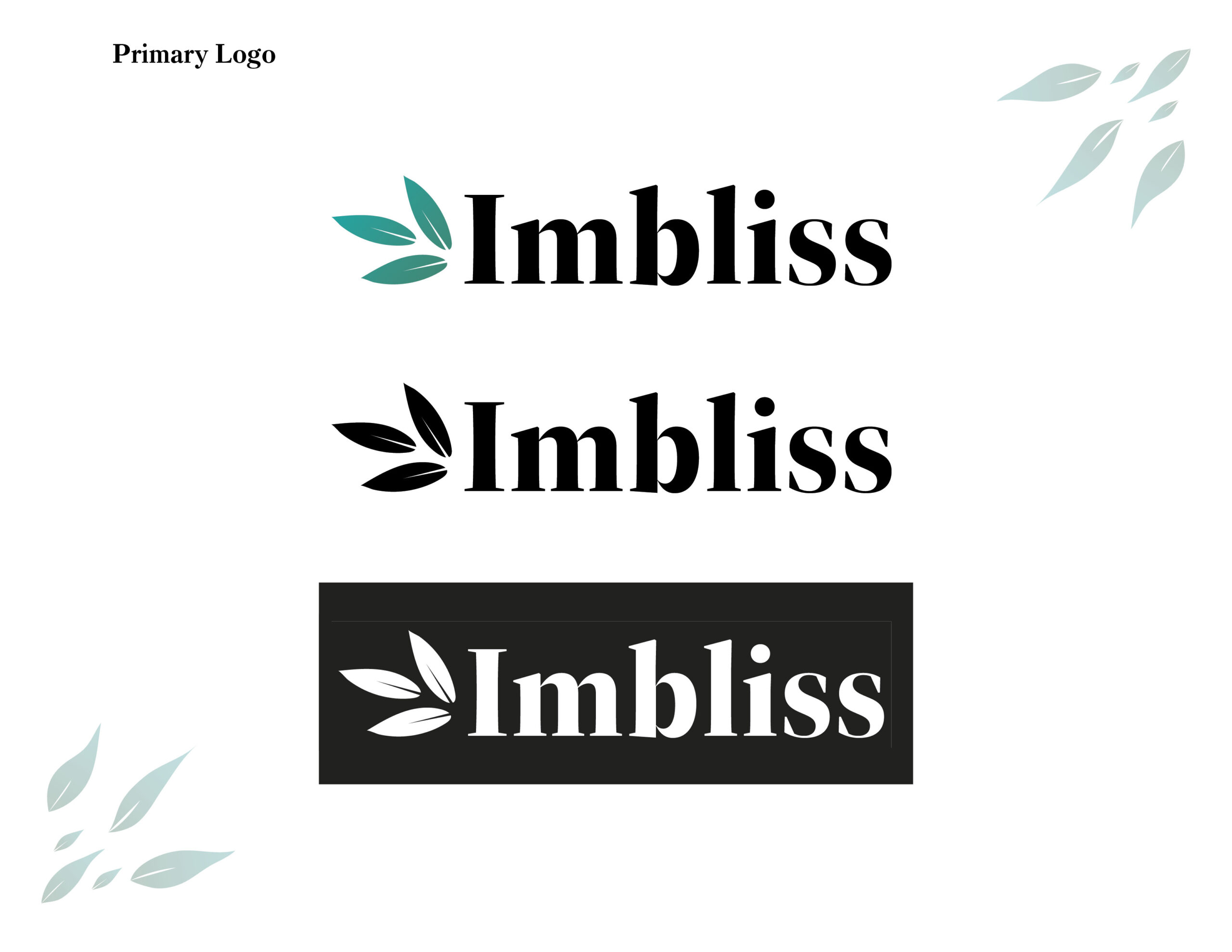
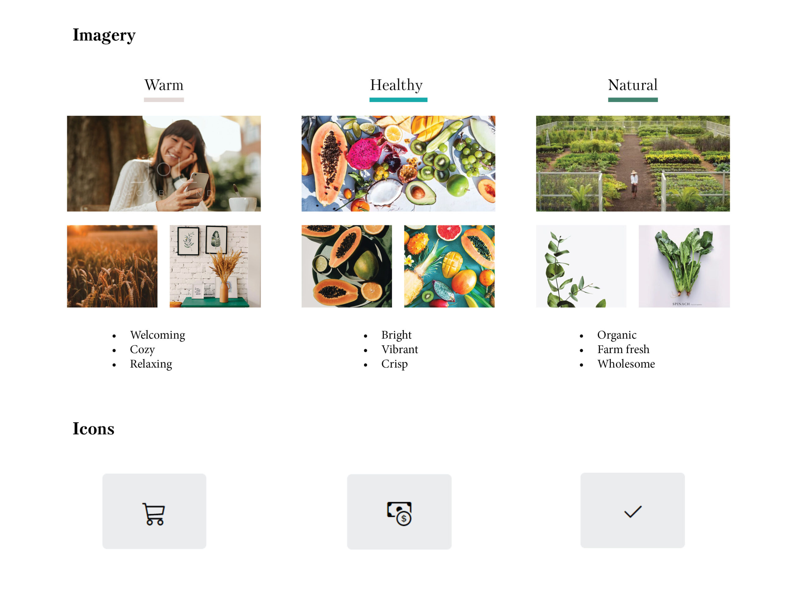
Keeping our target audience in mind I put together a comprehensive branding guide and logo. For the logo, we wanted it to appeal to our target audience and reflect our core values. Evoking feelings of trust and making sure it fits under the category of healthy/environmentally friendly.
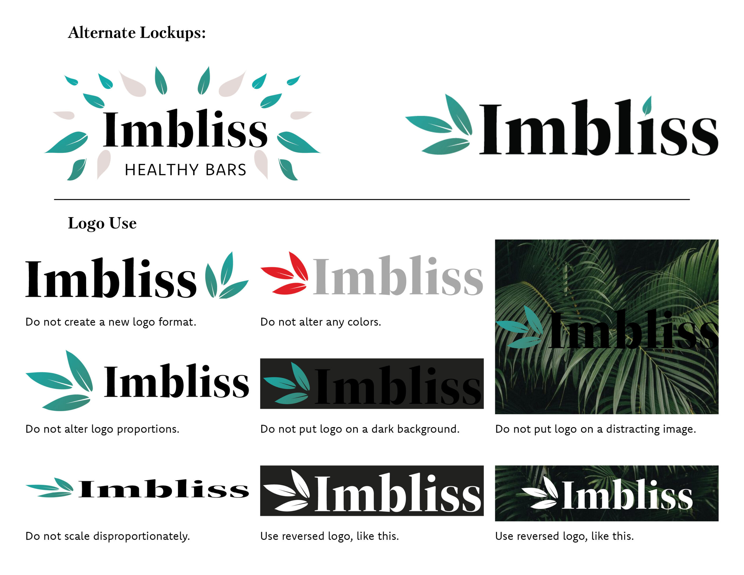
Link to my Branding Guide
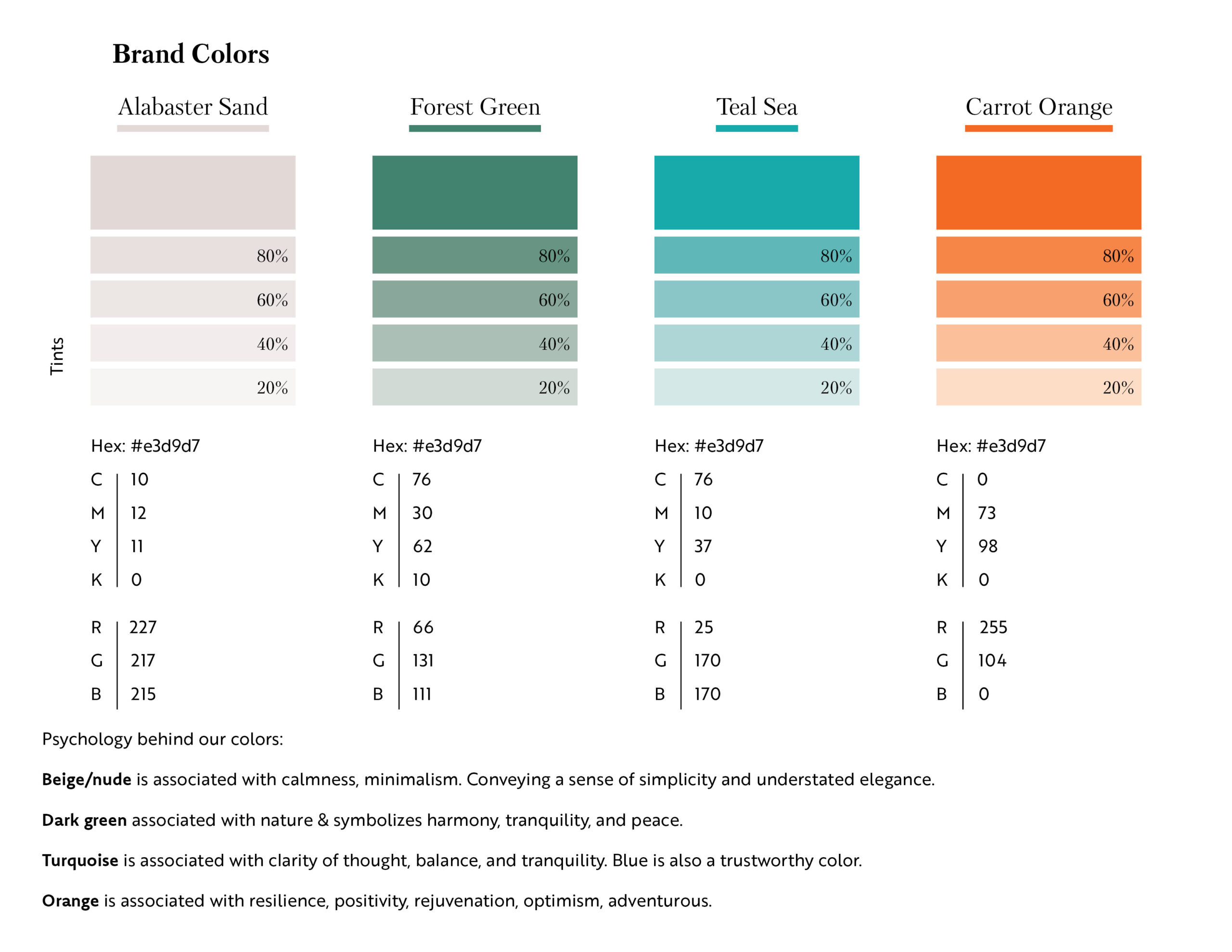
With this in mind, I selected a color scheme based on psychology and previous research on other healthy e-commerce brands. I chose a beige/nude color because it is associated with calmness and minimalism. Conveying simplicity and elegance. A dark green, it’s associated with nature, and it symbolizes harmony, tranquility, as well as peace. And is often associated with health and wellness, which is very important to our target audience. A blue turquoise because it’s associated with clarity and the blue tones also appear trustworthy to consumers aligning with our value to portray trust. And finally a bright orange. Orange is adventurous and associated with positivity and optimism. Appealing to the free-spirited and adventurous nature of the trendsetters/user personas.
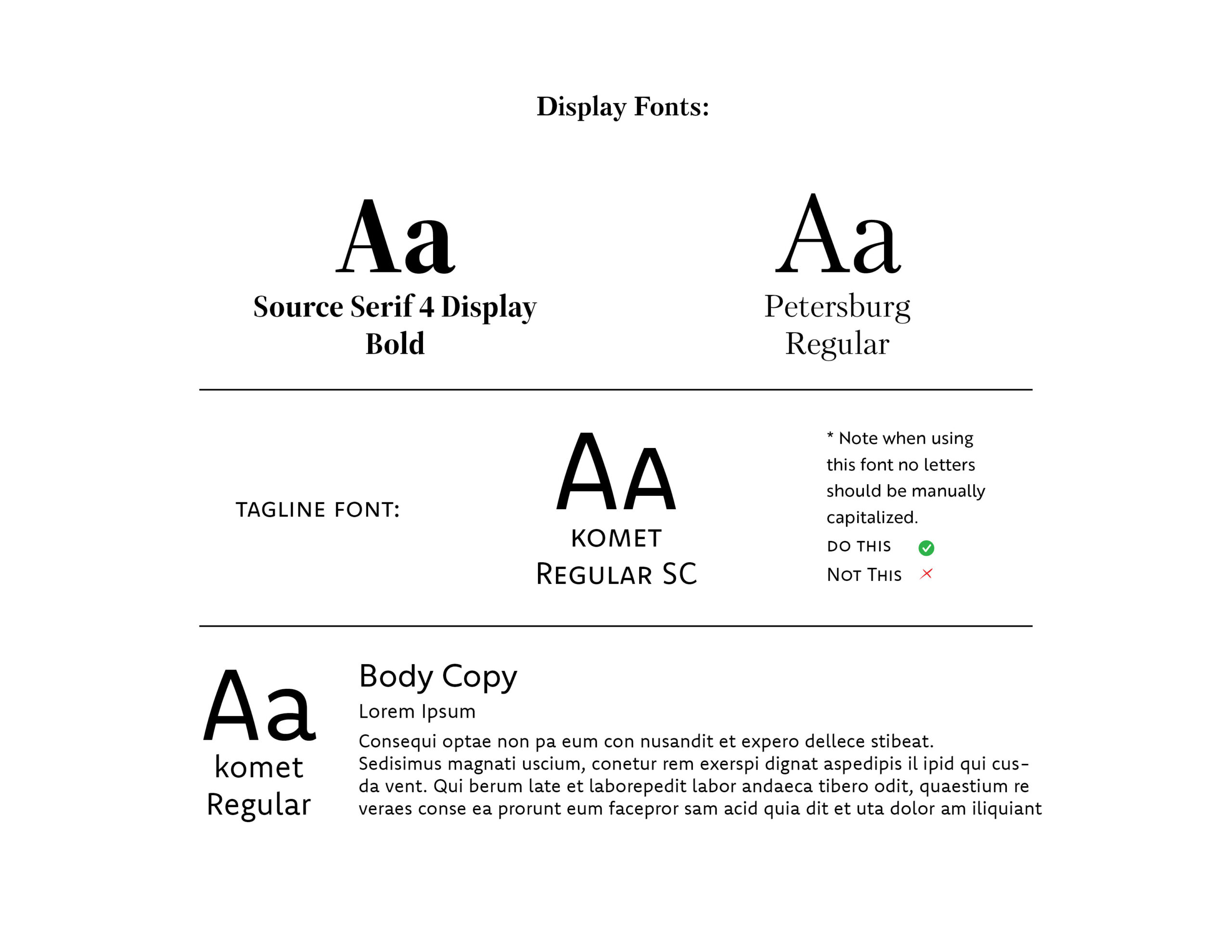
For the display fonts, we wanted these to be elegant, with a luxurious appeal to them. We felt that would appeal to our target audience because they tend to have expensive tastes. For the tagline font, we wanted something modern and minimalist that would complement the display fonts nicely. And finally, for our body copy on the website, I selected a san-serif font that is clean and easy to read.
After I created our logo and branding guide, I began working with Adobe XD. I created high-fidelity mockups of our website to hand off to the developers. Wireframe link.
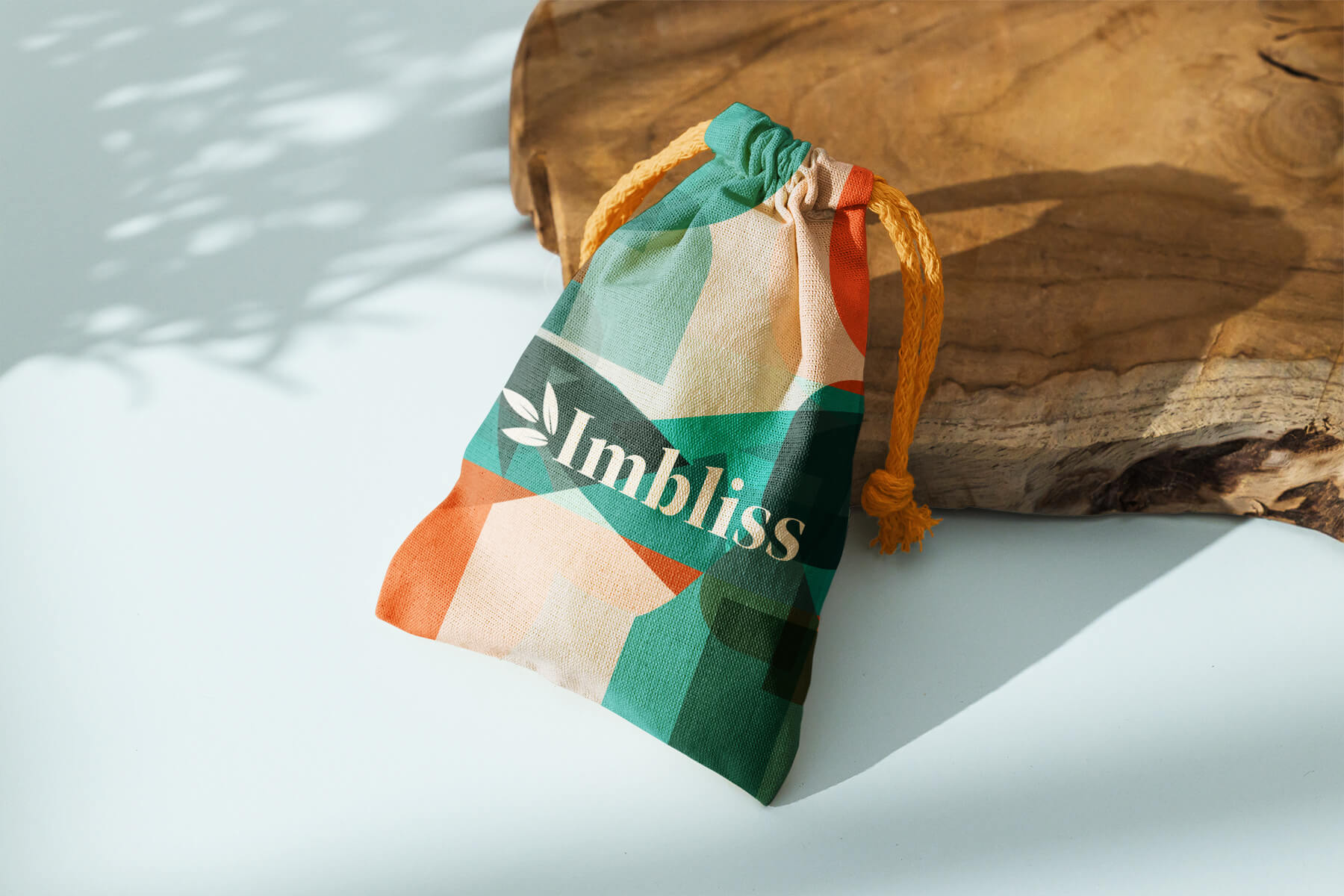
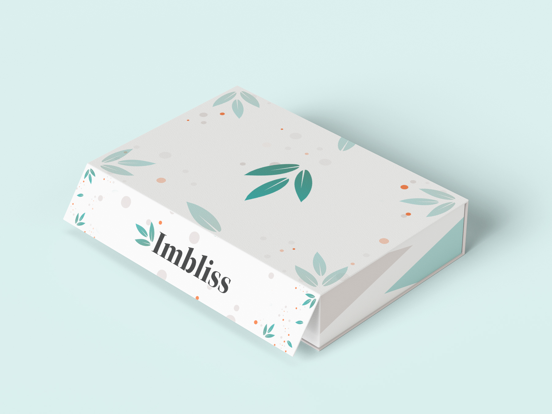
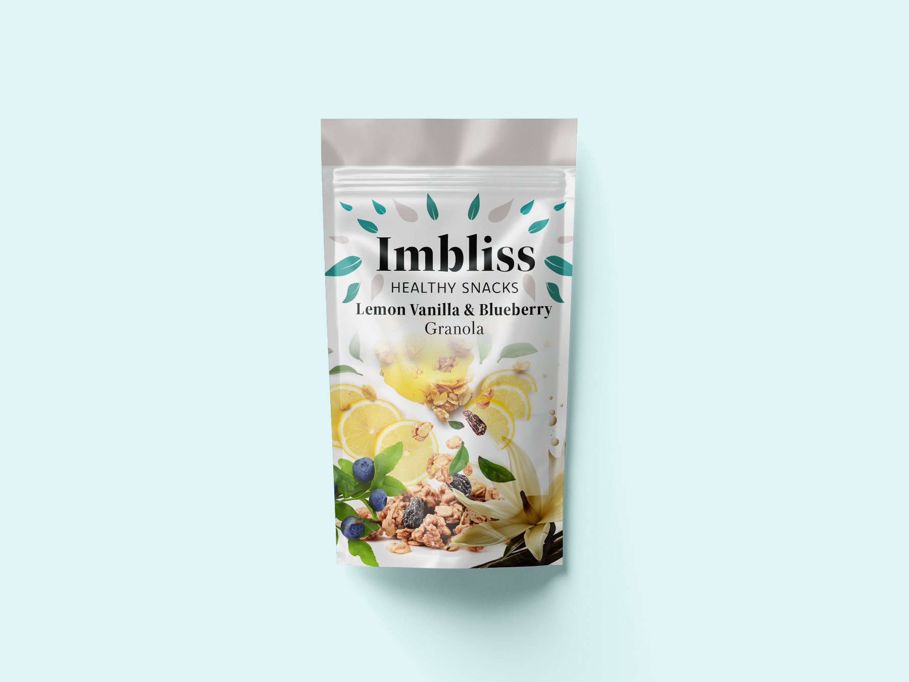
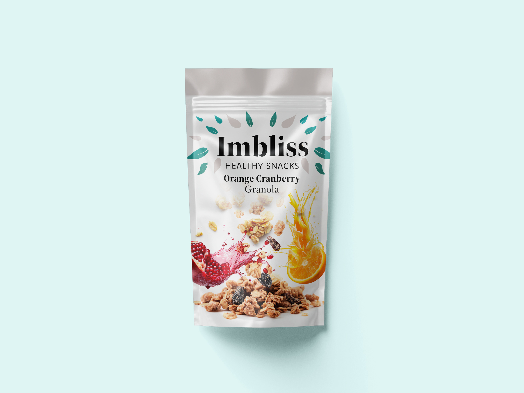
Product Mockups
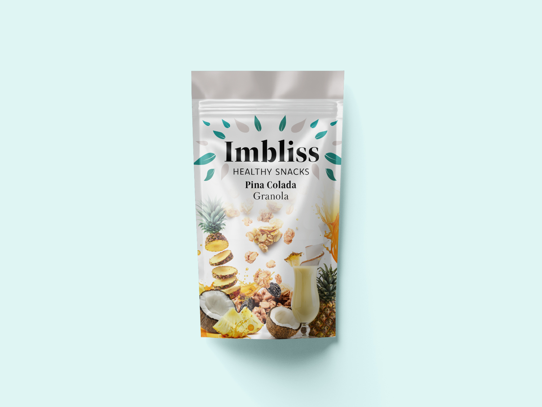
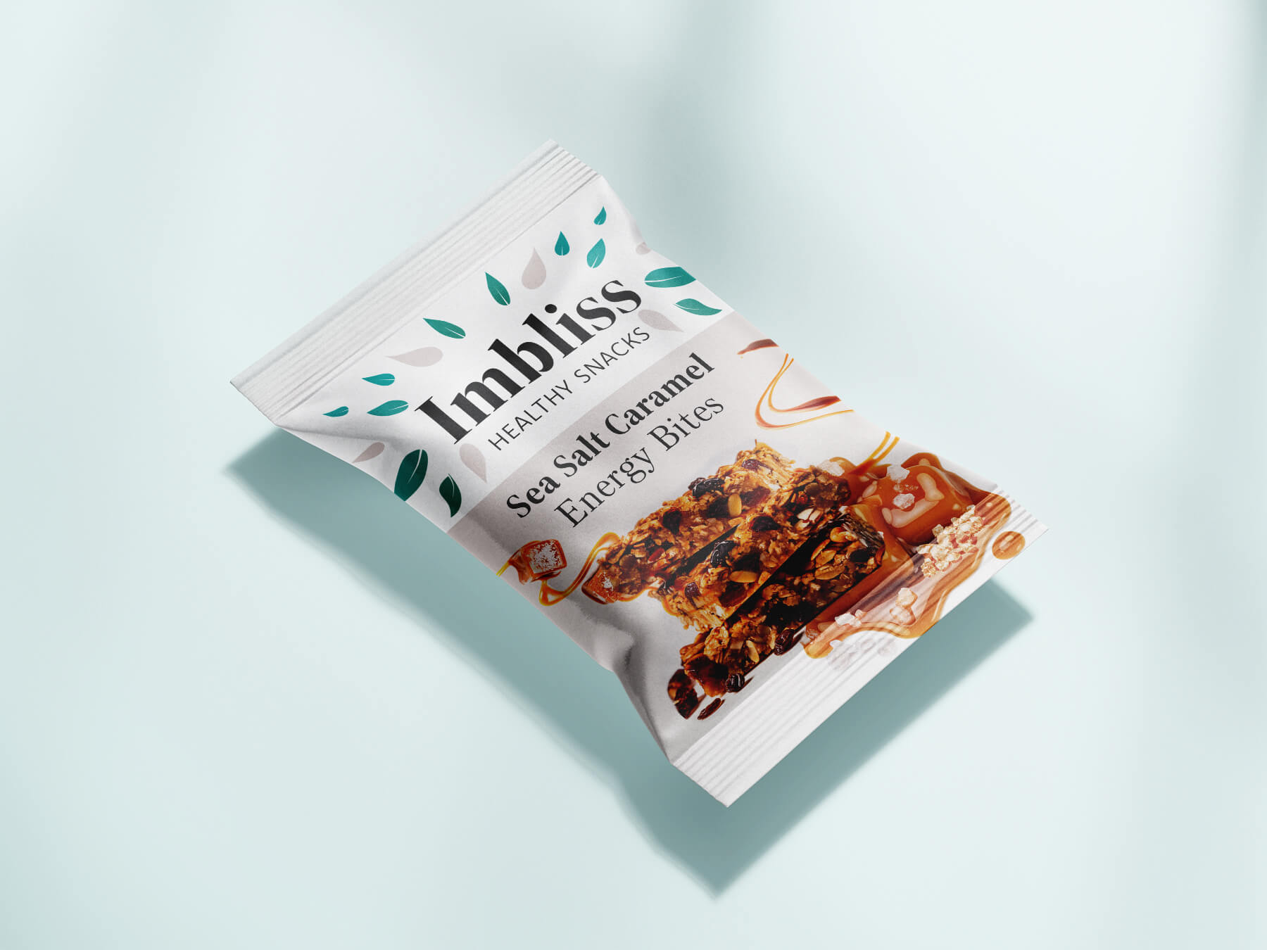
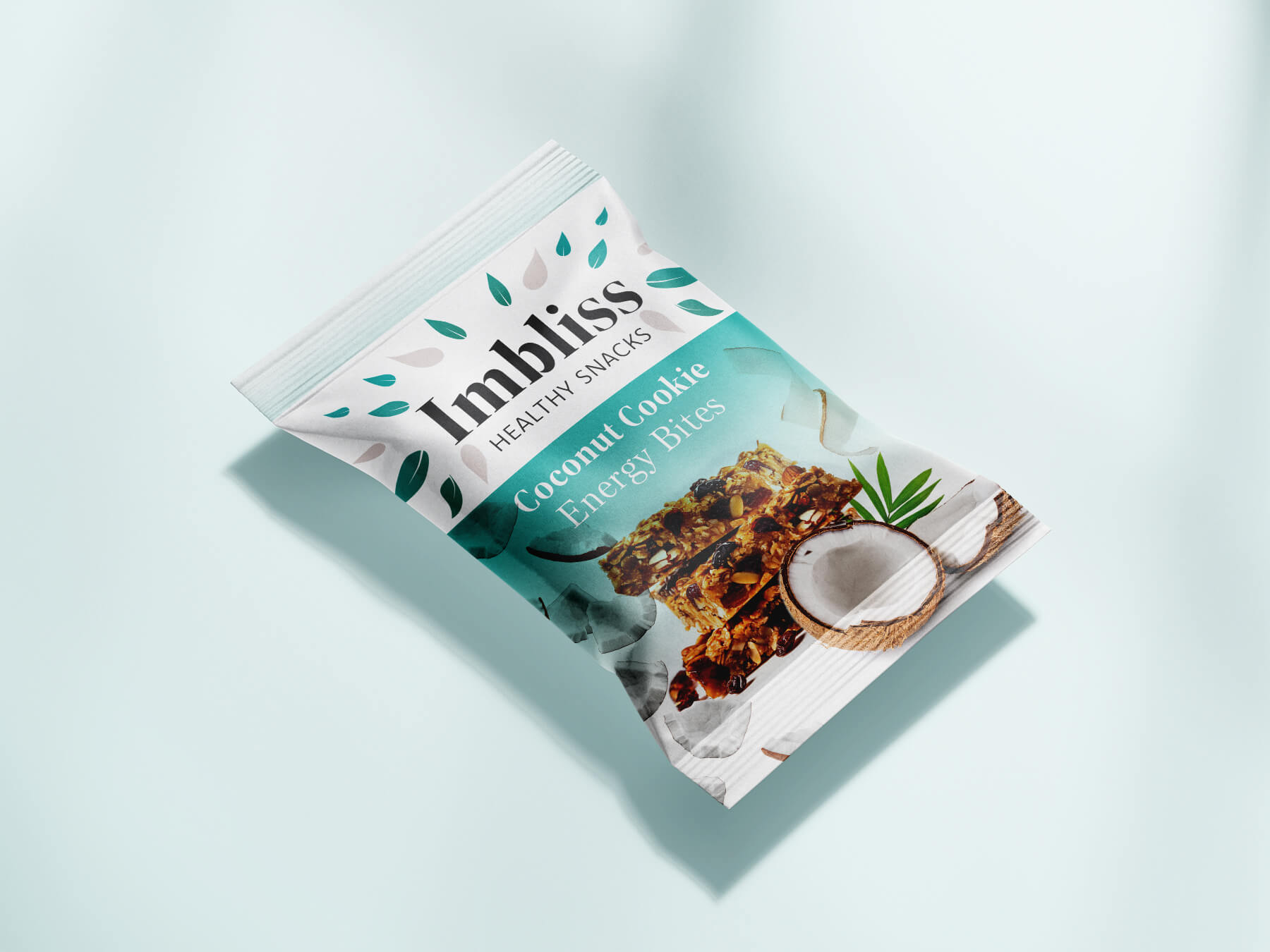
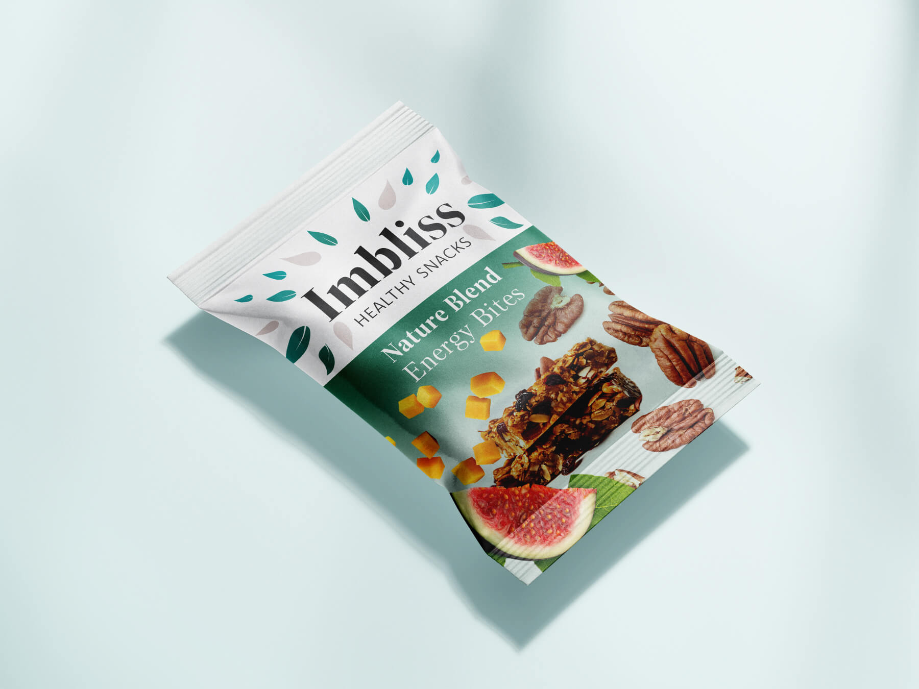
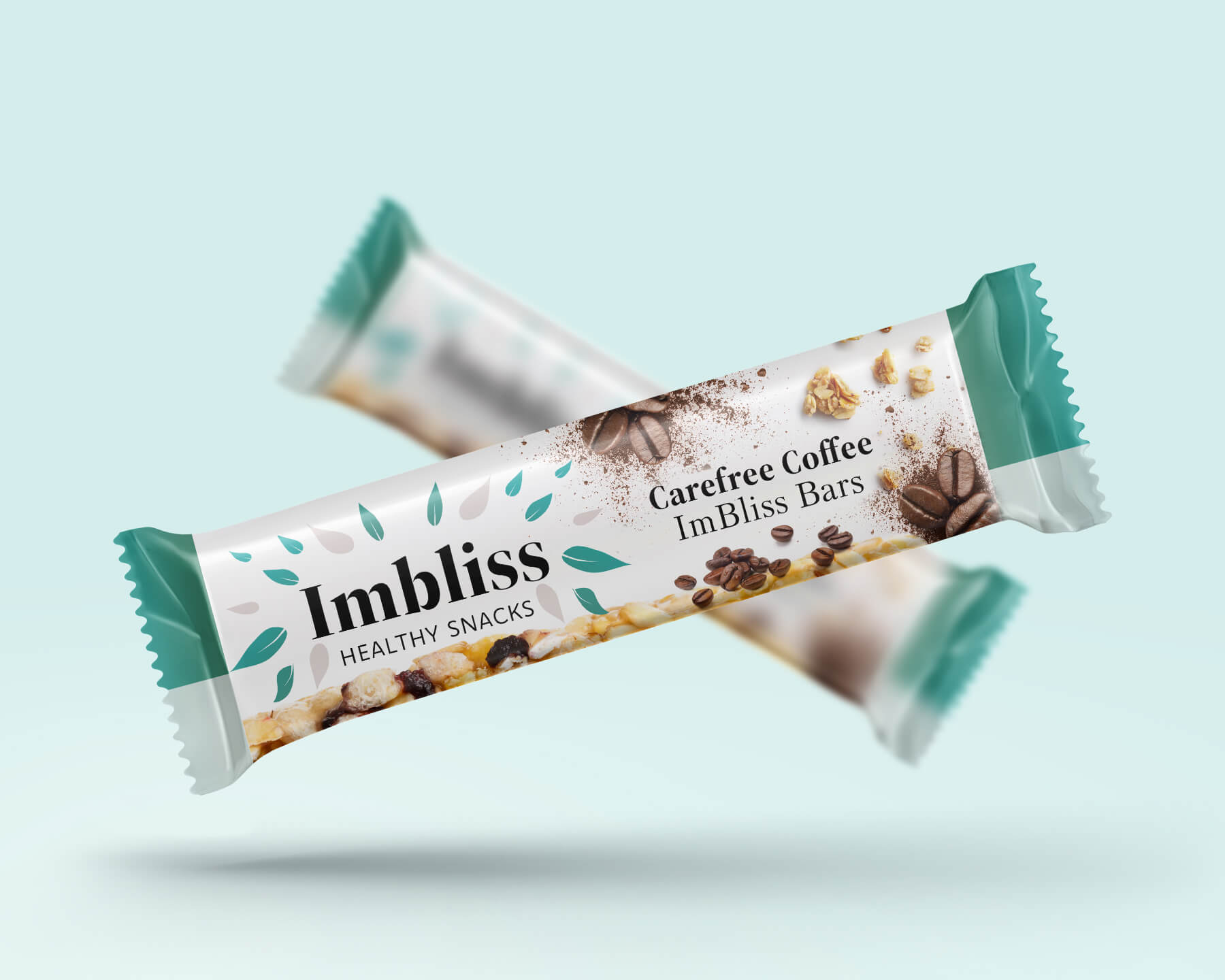
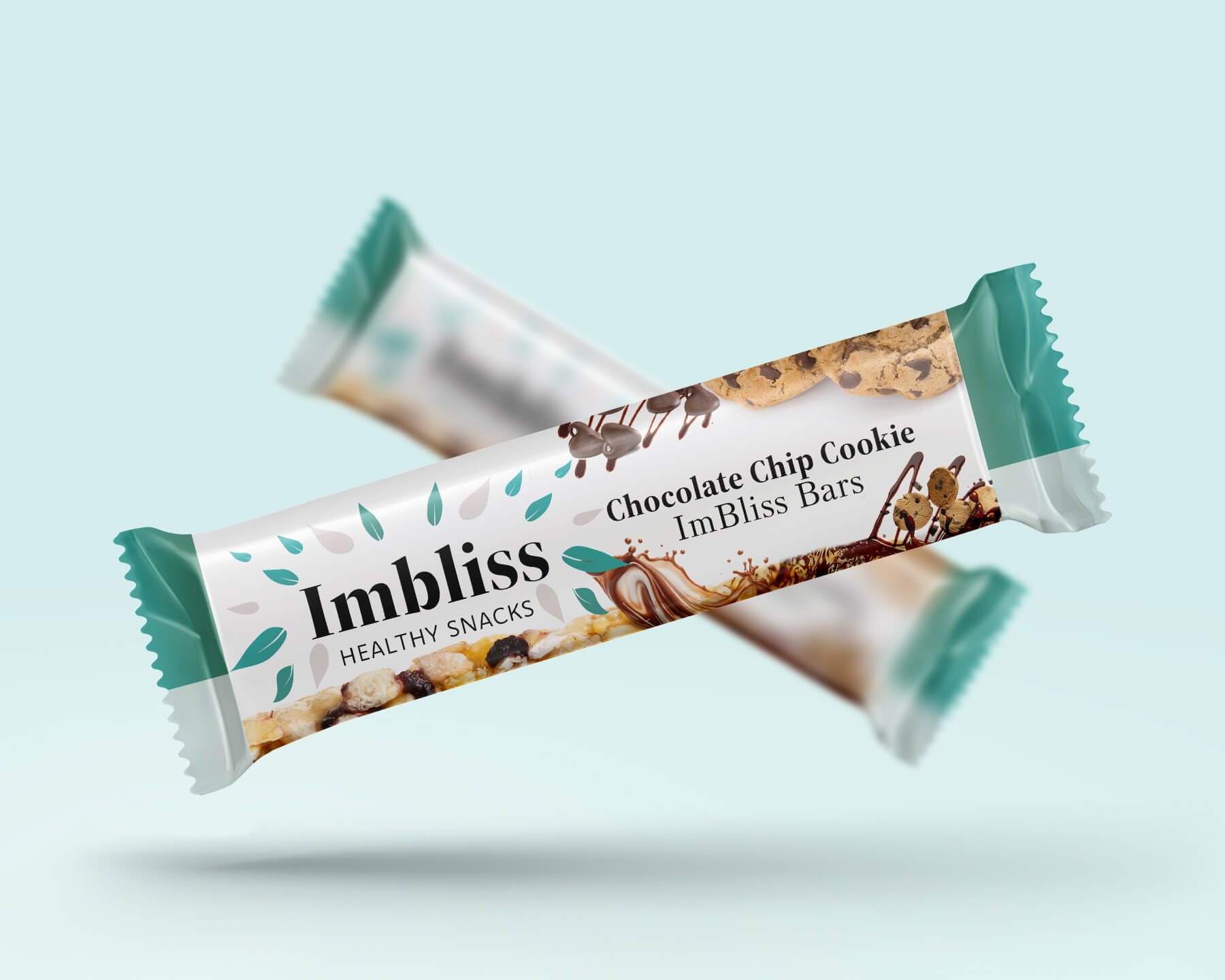
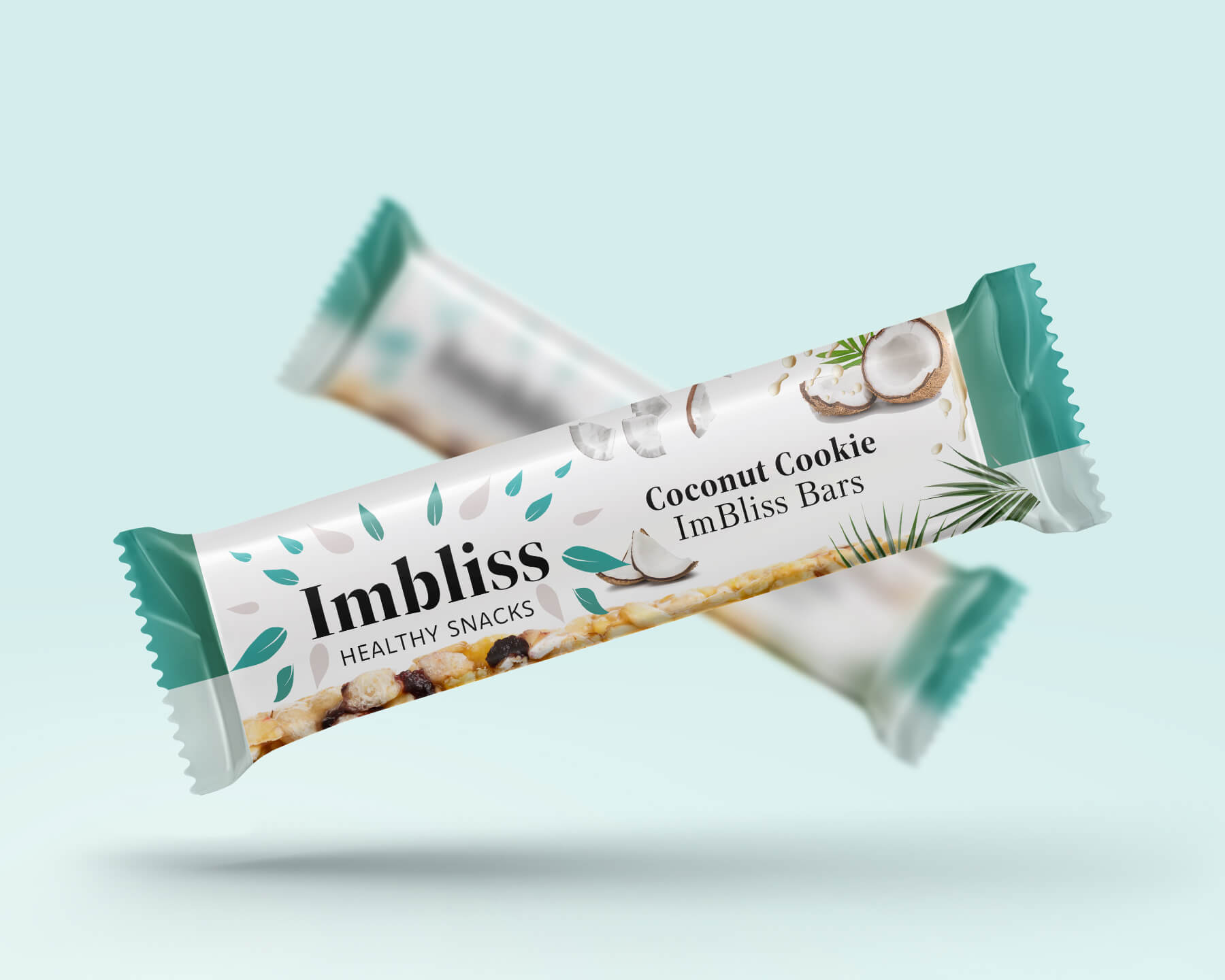
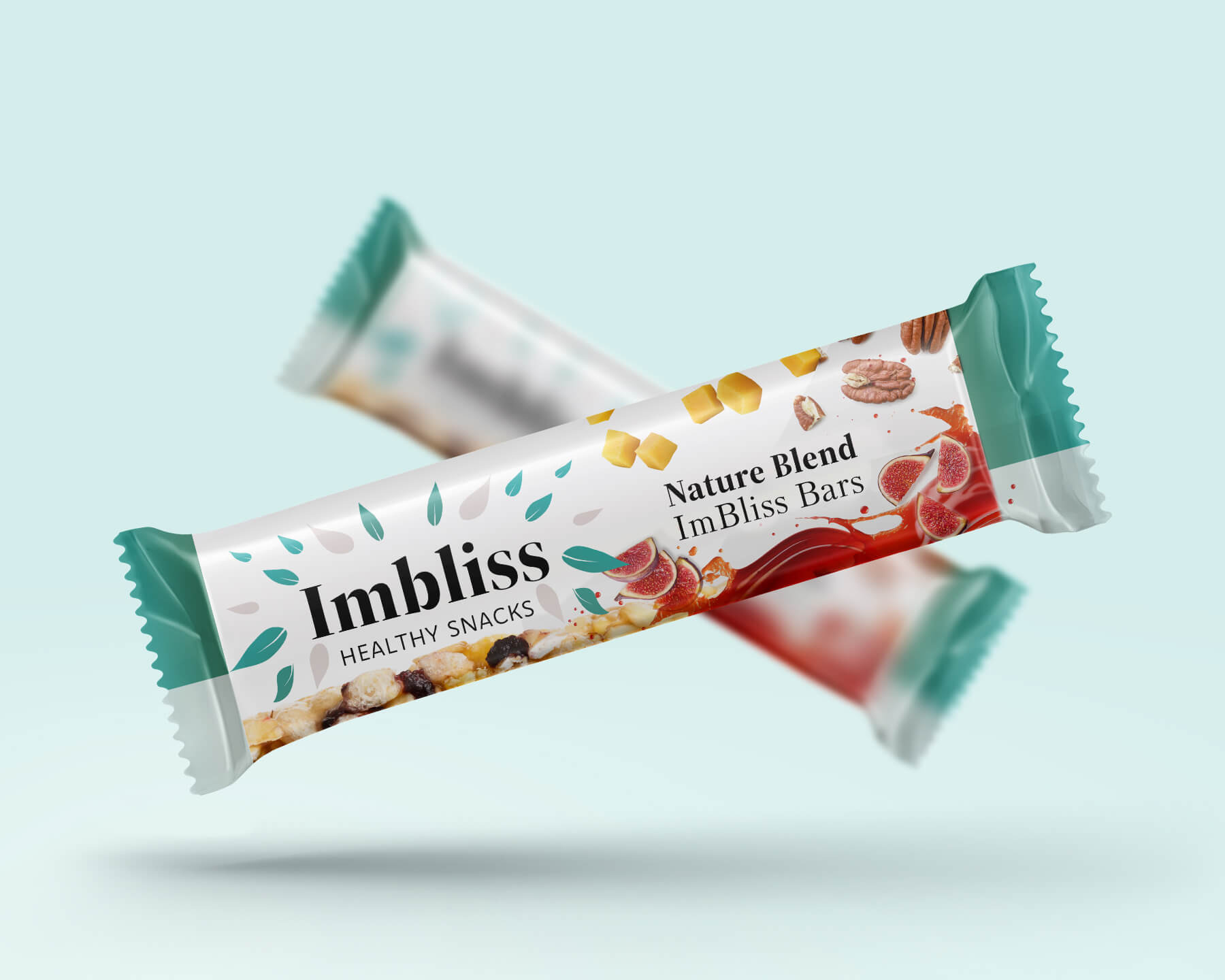
Lots of love and attention went into these product mockups. I spent about 40 minutes on each mockup, critiquing, adjusting, and creating the appearance. Our marketer did a wonderful job writing product descriptions, I thought it was only fair to have mockups that matched the caliber she set. I wanted them to be as realistic as possible, and match our branding.
I utilized Mockup-Design.com for the editable PSD. files, and Adobe stock for the imagery.
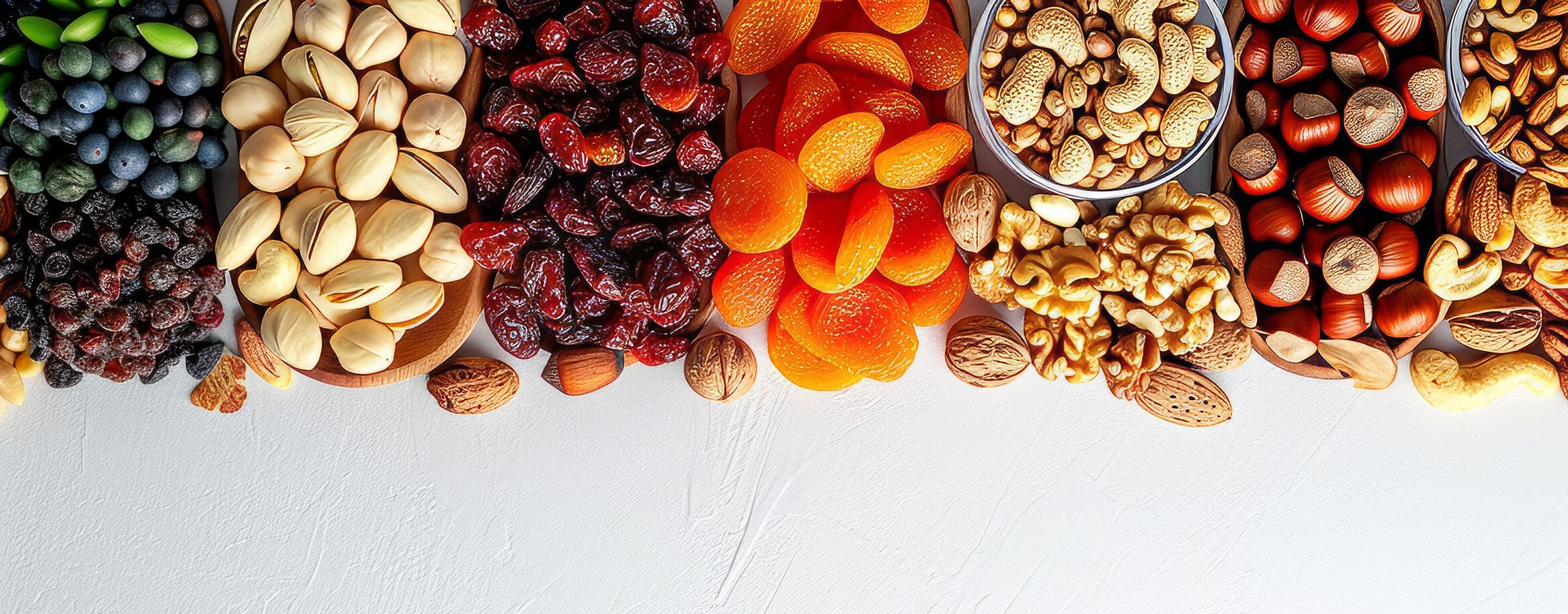
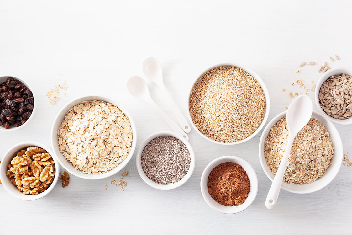
For the bar mockups, granola and variety pack-all the imagery is of key ingredients in the products. For example, if you were looking at the Carefree coffee bar, you’ll notice the coffee beans included on the packaging, and this is to make the products look more interesting and enticing. This also shows the viewer at a glance what they can expect from that specific flavor.
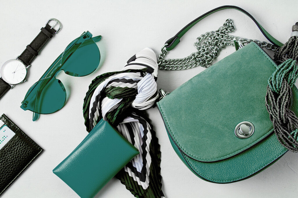
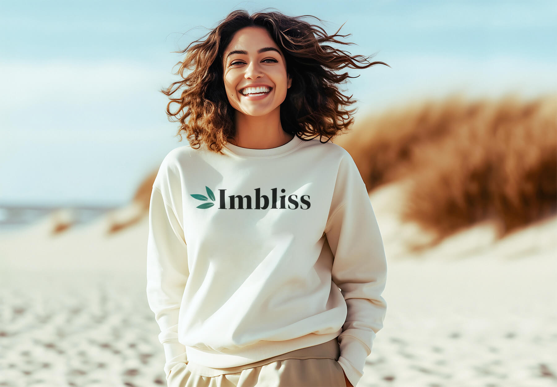
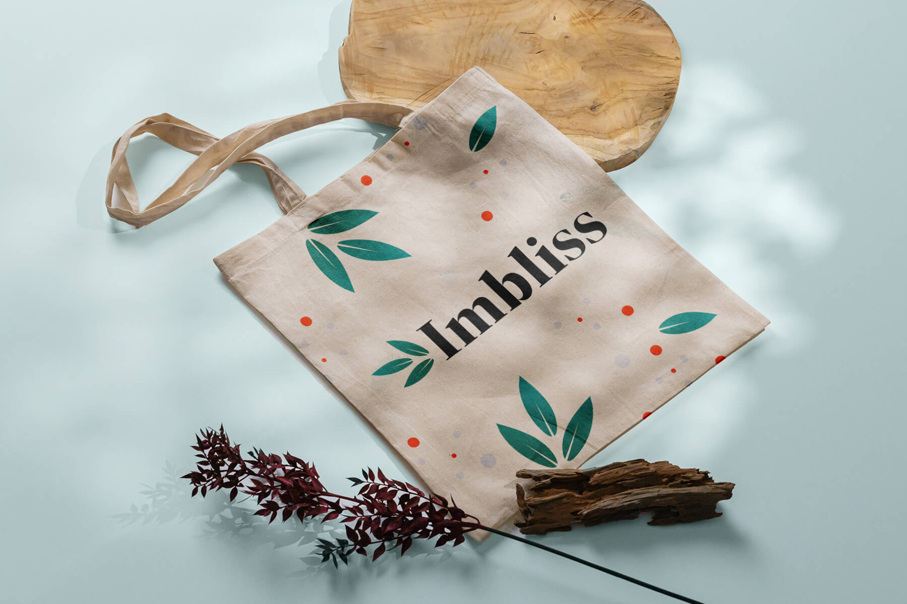
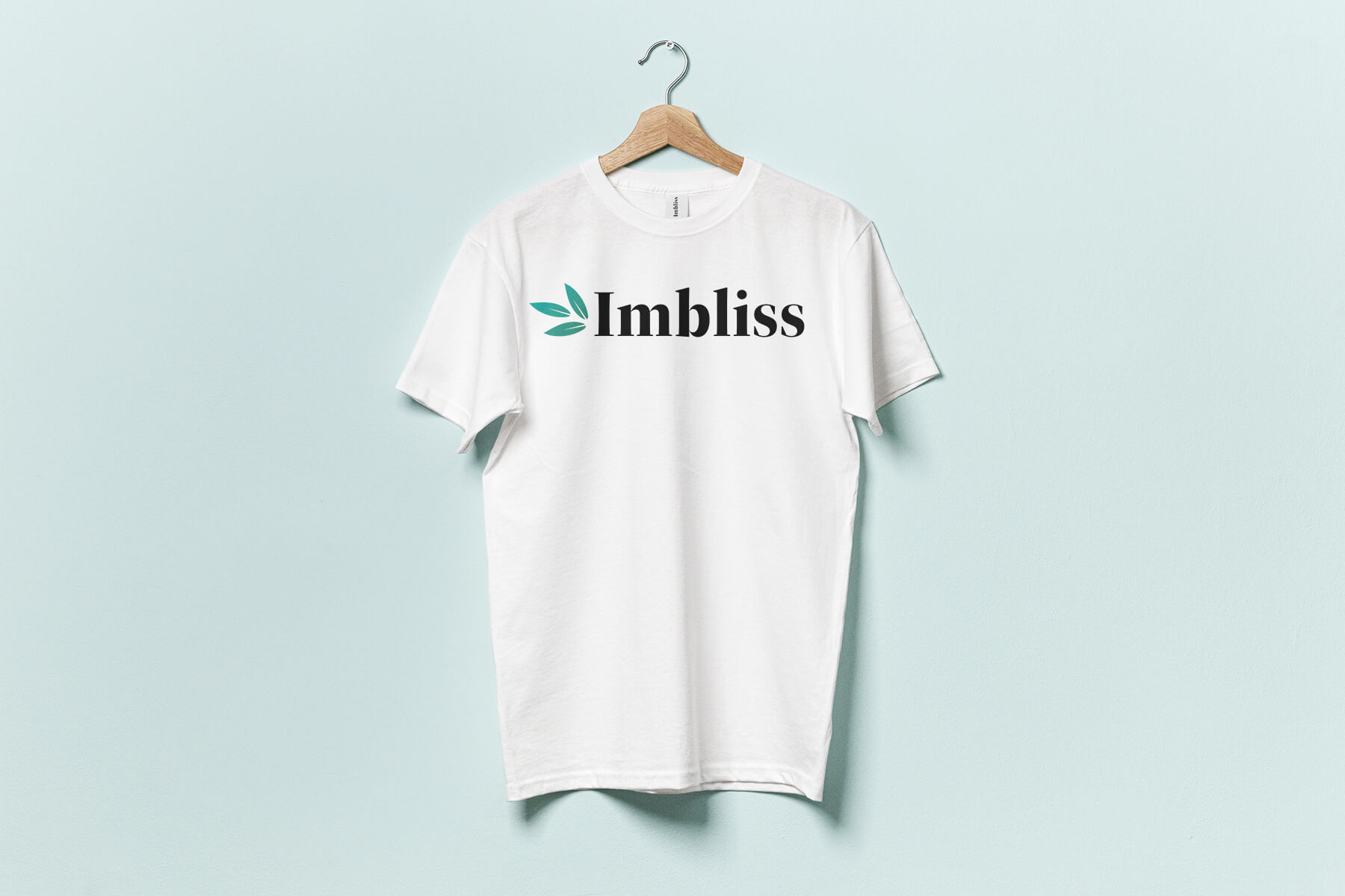
For the merchandise mockups, the bags shirts, and, sweatshirts, etc. I wanted these to be clean and clearly communicate our brand to the viewer. A brief reminder of our values we are climate-friendly, trustworthy, healthy, lighthearted, and feminine. I wanted these values to be reflected and portrayed in the imagery here so our products not only look inviting but appealing to our trendy target audience.
The Takeaway
For this class, I learned a lot. As a team meeting twice weekly online, communicating was a challenge. In the beginning, everyone had conflicting schedules so it was hard to get everyone in a meeting where we could discuss everything we needed to. And everyone had different opinions on how tasks should be completed. However, we overcame. Sacrificed our work schedules and the time we put into other classes, and made this one a priority. Under the guidance of a developer and myself, we were able to come together as a team and collaborate to the best of our abilities. We all learned to communicate better and collaborate to make ImBliss come to life. From this class, I am confident that I can not only lead a team, but navigate the challenges that come with it better than I could before I had this experience.