My Work


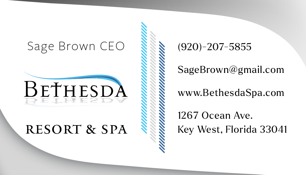
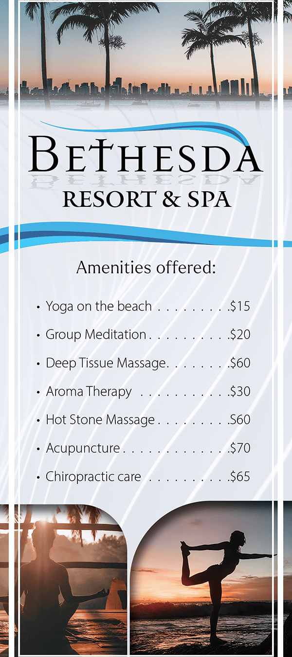
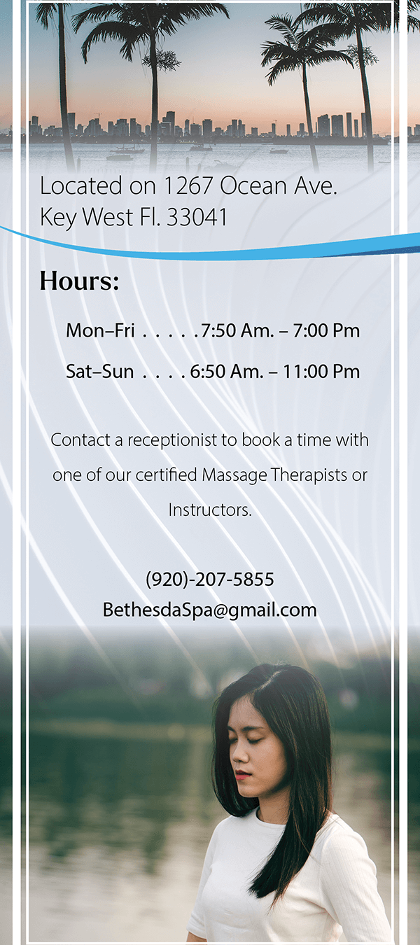
Resort Marketing Materials
For this class project, I was tasked with creating resort and spa marketing materials. These included a Business Card, a Rack Card, and a Logo.
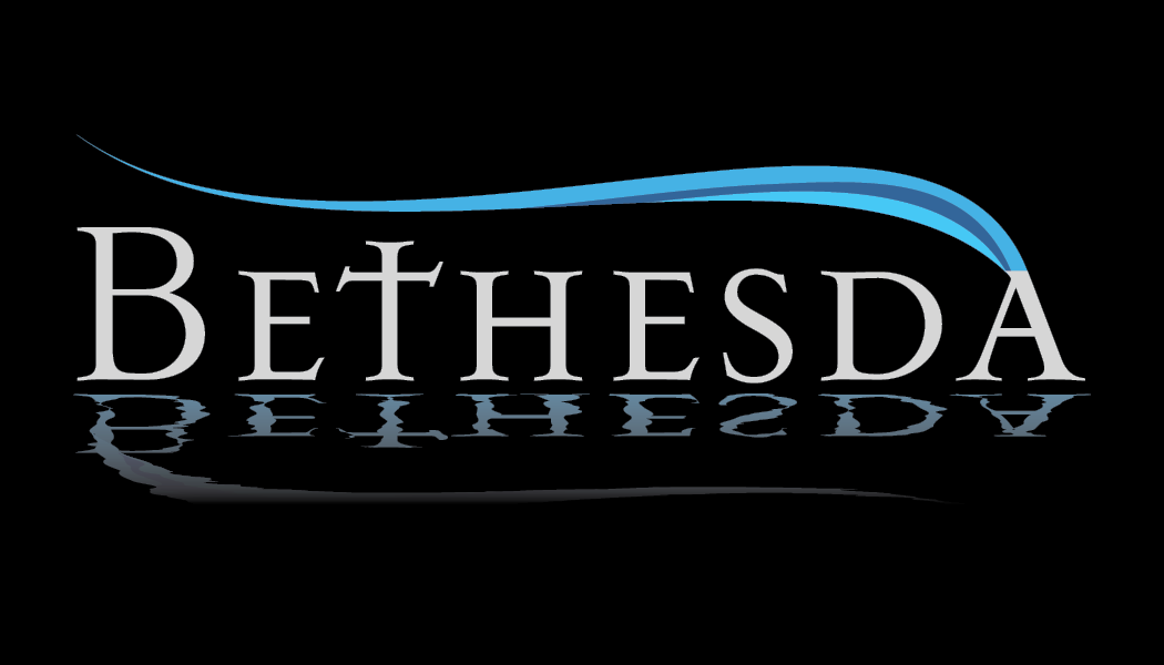
- I took inspiration from the biblical story in the Gospel of John that mentions Jesus healing the paralytic at the pool of Bethesda, this is how I came up with the name.
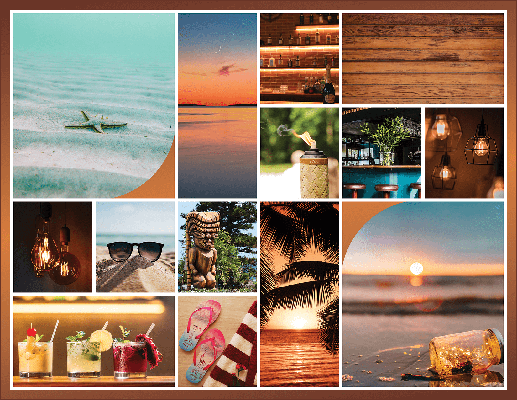
- My target audience is middle-class individuals seeking an escape from stress and looking for a healing experience. I wanted to reflect this in my color scheme and overall design choices.
- To make these deliverables I utilized a combination of Photoshop to boost the overall composition of the photos, Illustrator to create the logo, and finally, assembled everything in InDesign for the result.
Restaurant Marketing Materials
For this class project, I was tasked with creating marketing materials for a restaurant. These materials included an original flyer and menu design for a company that does not currently exist.
- First, I started with a fun name. I wanted the name to be a play on words from the 1986 film The Three Amigos.
- My inspiration for the overall look was a summery, beach theme. This is demonstrated by my mood board.
- Throughout my designs I wanted to convey the feelings of a lively warm atmosphere where one would go to catch up with friends and enjoy a drink or two.
- I created the logo using Adobe Illustrator and refined it in Photoshop. As for the menu and flyer, I elevated the appearance of the photos I selected and then crafted the layout
using InDesign.
Cheese Logo & Label
For this class project, I was tasked with creating a comprehensive visual identity demonstrating consistent, moreover, creative uses of a logo, and color scheme.
- My target audience for this project is luxurious and sophisticated individuals. This is expertly communicated through my use of typography and color scheme.
- When designing the logo, the first cheese that came to mind was cheddar cheese. And when I think of luxury, my mind immediately went to a suit and tie. As I was researching other elements along those lines I stumbled upon a pocket square and that’s when these two elements collided. When I pictured a customer going to buy this gourmet cheese I pictured them, “looking sharp.” This is how I came up with the name for this logo.
- To create these designs I utilized Adobe Illustrator.
Movie Poster Design
For this class project, I was tasked with creating a realistic movie poster.
- To create this composite I utilized Adobe Photoshop.
- I wanted to create a sequel to the previous Pirates movie, “Dead Men Tell No Tales.”. So to begin this process I researched previous movie posters from the franchise and took note of the similarities. I made sure to replicate this in my design too so it would be similar to the previous ones but be distinct on its own.
- I wanted the poster to have a darker feel to it, communicating feelings of dread. This movie would be full of action and intense. It also would have a previous antagonist returning and I hinted at that in the center of the poster with the flying Dutchman’s hat. I also incorporated elements from previous movies to hit at this as well, I felt this would excite any viewers that are familiar with the franchise.
- I came up with the name Horizons End, in the previous movies they usually have Depp referencing the horizon, and this movie would be the last in the franchise, signaling its end. As a result, I combined the two, creating the name.
Magazine Design
This was a class project I was nervous to tackle at first, but soon fell in love with the process, and overcame the challenge.
- I created this 16-page magazine using a variety of software, namely Adobe InDesign. However, I utilized Adobe Photoshop quite a bit. In this magazine, every page was analyzed and assembled with care. Every story is connected to something I’m passionate about-I absolutely LOVE The Chosen, it’s only fair that they get rights to the first and last pages. And everything in between somehow connects to eternity.
- The inspiration for this magazine came from a podcast my father shared with me called, Real Near Death Experience Stories. And these stories are incredible. (If you’d like to listen yourself, I have a QR code embedded within the magazine on page 6) One of these stories became the feature article for this piece. Ian McCormack was night diving when he was stung by the world’s deadliest, venomous jellyfish 5 times. The locals on the island Ian was visiting call them ‘invisibles’, they are nearly see-through and only noticeable when it’s too late. Miraculously Ian survives, well not before he kicks the bucket. If that caught your attention I urge you to read the rest of his testimony starting on page 8.
- Design-wise, this magazine is a culmination of all my skills poured into one beautiful piece. As I mentioned earlier I utilized Adobe Photoshop for a variety of things; resizing images, creating striking composites, and enhancing the photos I gathered from Adobe Stock. Everything else was laid out and perfected using InDesign.